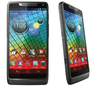
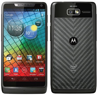
The Motorola Razor is deserving getting a lot of buzz. Remember, a phone by the same name was the phone for quite some time just a few years ago, and now the newest generation is getting some praise. There are a lot of good things that really work out for people who decide to purchase this mobile, as it’s one that has a lot of speed, and the design isn’t actually all that bad. Though, people are more interested in how the UI (User Interface) actually works, as Motorola has been catching more than enough flack as of recent because of some of their poor changes.
Though, with it running Android 4.0, a lot more people are excited about the chance of getting something that doesn’t have a lot of Motorola’s interface put into it. While it’s not completely gone, it’s definitely a long way away from a lot of their older stuff, which is widely considered a good thing, especially when you think about where they were a bit ago.
No More Moto BLUR
If you’ve owned a Motorola phone in the past few years, you’ve probably developed a pretty strong disdain for Moto BLUR. This is something that we understand quite a bit, as we think that it was personally atrocious. Not only was it pretty clunky, but it also didn’t serve a lot of use for people. There were some worse UI (User Interface) choices, but it’s definitely a good thing that they’ve decided to go with a pretty popular MOS. Android 4.0 is definitely an upgrade, and those looking for a good mobile operating system should know that this version really fits the bill, even though it may not be perfect.
Decidedly Simple
Of all of the things said about this operating system - such as it being open source - the fact that it’s pretty simple is good enough. This is the reason why it controls a pretty commanding market share - everyone can use it. The Razor is a pretty good example of it done right - you have just about everything that you’re expecting a phone to have but laid out in a pretty simplistic way. There are some Motorola touches, though. It sits dead centre, and features things like the current weather, battery level, and the time. It’s not intrusive, and this is probably the only thing that separates this phone from the current stock version of Android 4.0.
The UI (User Interface) on this phone is pretty good, though there may be some people that are thrown off by the fact that it’s actually a bit bare. This is by no means a bad thing, as most people would rather have something that doesn’t have a lot of things going on as opposed to an operating system that’s nothing short of clunky. If you’re a person who wants something simplistic, yet actually a bit beautiful, there’s a chance that you’ll appreciate what this mobile phone has to offer you.


0 comments:
Post a Comment